Brand: Huawei
Owned by: Huawei Technologies Co. Ltd.
Design: Unknown!
Design brief:
“Huawei’s logo reflects its principles of customer-focus, innovation, steady and sustainable growth, and harmony, conveying Huawei’s sincere commitment to helping its customers realize network transformation and launch a variety of competitive services through continuous innovation and an enterprising spirit.
The radiating shapes of the icon are focused on the bottom center and indicate Huawei’s commitment to creating long-term value for our customers based on our customer-oriented strategy.
A confident and optimistic symbol, the new logo conveys a sense of maturity and steadiness in a professional and international manner. Adopting a graduated tone while keeping symmetrical, the new logo looks more natural and compatible, and acts as a metaphor for Huawei’s open-minded attitude and partnership strategy, indicating that Huawei will maintain its healthy growth and create a harmonious business environment.”
Logo release: May, 2006
Previous Logo:

Rays and Lotus
Huawei does not specifically mention on what the logo is based. To me it looks like sun and its rays. To think of it, light is a form of electromagnetic radiation. The logo can also be electromagnetic radiation emitting from a point source like an antenna — this is the best fit to Huawei as they are a telecom major.
Lotus
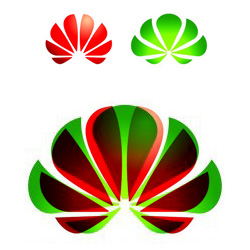
If you feel that Huawei logo looks like lotus — a flower — well, you have got company.

Logo owned by Pankajakasthuri Herbals India Pvt Ltd.
Read the design story of Pankajakasthuri logo here. Following is a comparison of the two logos — one overlaid over the other.
More ‘Radiations’
Following logos have a distant relation to the electromagnetic spectrum.
Cisco Systems Inc.
Relevant links:
- Huawei: Brand & Logo
- Huawei: letter to customers regarding change of logo
