BRAND
Kodak
OWNED BY
Kodak
LOGO DESIGNER
WORK-ORDER
OFFICIAL DESIGN BRIEF
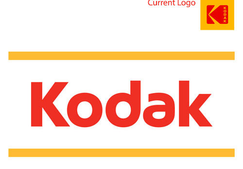
Under new leadership, Eastman Kodak Company was determined to invest in the product values that established it as one of the 20th century’s most culture-defining companies. Central to this mission was a brand reset that would be as confident as the tools it was creating.
From the brand positioning principles to packaging guidelines, our solution honored the company’s legacy of optimism and scientific heritage while also navigating a move toward the future with purposeful branding and a new business perspective.
Drawing on the heritage of Kodak’s trade dress Yellow was our first and most crucial step. Next was to bring back the “K” icon, one of the most recognized logos in the world. Finally, we retooled the Kodak wordmark with the icon. Our goal was to make it feel both modern and timeless, and to create a more natural integration with the symbol.
LOGO RELEASE
October 2016
PREVIOUS LOGOS
1 Response
[…] June 19, 2010 Anas KA K Logotype Read Kikkidu’s story about the Kodak current logo (2016) […]