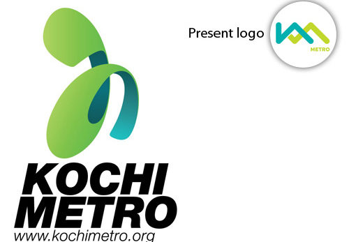
Brand: Kochi Metro
Owned by: Kochi Metro Rail Ltd. (KMRL)
Logo Designer: TATA ELXSI Ltd. and Brash Brands.
Click here to download a high resolution logo
Design brief:
The new logo is an icon of Kochi’s seamless transportation. An aspirational use of ‘Connect to Prosper’ embodied the basic function of public transport, whilst harnessing a language of success and accomplishment.
Logo release: 03 September 2015
Previous logo
 Read about this “ka” logo of 2012 here.
Connect To Prosper
Public transport connects people and places. The complexity is evident from maps of public transport. Following is an example of ‘London Tube.’
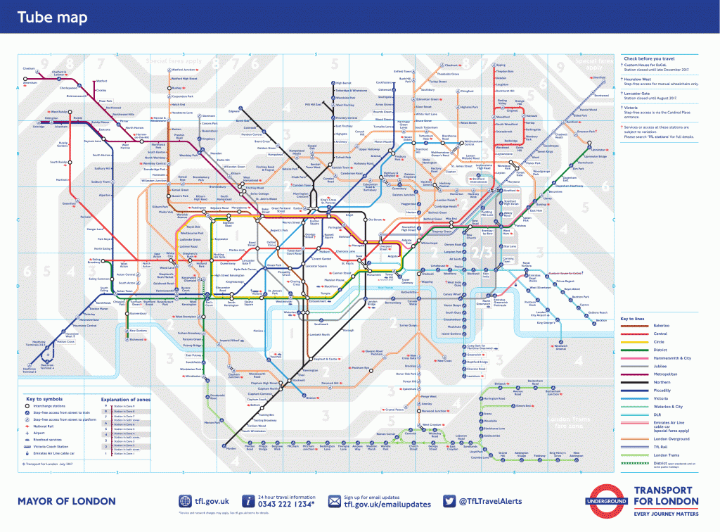
It appears that the inspiration for Kochi Metro logo came from these colored lines and connections on a map.

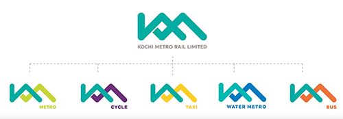
If you look at the variations of the logo for different modes of transportation, you will understand the emphasis brought out by color.
Here is another video published by TATA ELXSI that details the entire service design of Kochi Metro — from tickets to train and station interiors.
‘Ka’ Logo or ‘Factory’ logo?
I belong to the minority of people who think that the dynamic and curvy 2012 ‘Ka’ logo was better. Why? When was the last time you saw a logo that is based on a Malayalam alphabet?
The current Kochi Metro logo brings out the memory of a factory chimney and its corrugated roof. Probably I will start seeing the ‘connections’ more as I get used to the logo 🙂
Similar Logos

Relevant links:
- TATA ELXSI LTD: Kochi Metro Rail – Designing the end-to-end passenger experience for enhanced travel
- Brash Brands: Kochi Metro — Defining the ambition of Kochi and its people through transportation
- Kochi Metro Rail Facebook Page: our New Logo
- KochiMetroRail YouTube Channel: New Brand Identity for Kochi’s Integrated Transport System
- International Business Times: Kochi Metro Rail Limited (KMRL) Gets New Logo; Kerala CM Oommen Chandy Unveils Design
The information provided on website about Logos is absolute fantastic. Great Job.