
Brand: Micromax
Owned by: Micromax Informatics Limited
Logo Designer: Eric Atkins, Washington
Design brief:
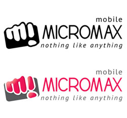
The ‘Punch logo’ is a true reflection of the Micromax brand which is young, innovative, dynamic, bold, extrovert and fun. Inspired by a hand, holding a mobile phone.
Logo release: 18 March 2012
Previous logo:
A hand clenching a phone!
This was a crowd sourced logo through a competition. The logo cleverly depicts a hand clenching a mobile phone. The hand knuckles form an ‘M’ and an inverted ‘i’ of ‘Micromax.’
I liked the logo. In my humble opinion, the “Mi” logo should be tweaked more to seamlessly gel with the logo type of “cromax.” Now the “Mi” looks cartoonish, and “cromax” looks more serious.

This is a quick tweak from my side, attempting the uniformity of the fist and logotype. It is not at all perfect, but you understood the concept, right?
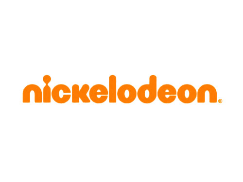
Speaking of “Mi” of ‘Micromax,’ how can I not to mention the “Mi” logo of Xiaomi?

surprisingly, the color palette is the same as Micromax. But, no fist or punch here! Probably the logo is inspired from the Chinese letter form of ‘Xiaomi.’ The company came into existence in 2010. I don’t know whether this logo and color palette was in use since 2010.
Eric, where are you?
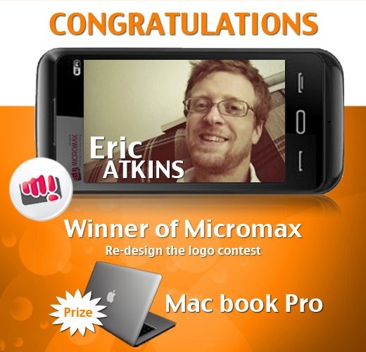
I couldn’t find any details of Eric Atkins who designed this Micromax logo as part of the competition. His page in TalentHouse website doesn’t have any useful info.
This was the original submission by Eric.
Relevant links:
- Micromax Press Release: Micromax unveils its new brand logo
- IBN Live: Micromax comes up with a new brand logo
- TalentHouse India Facebook Timeline Photo: Congratulations, Eric Atkins
- TalentHouse India Facebook Timeline Photo: Akshay Kumar unveils Micromax logo during India vs Pakistan cricket match of Asia Cup 2012
- afaqs!- Micromax mobiles on talent hunt for new logo
1 Response
[…] Read about this ‘Hand clenching a Mobile Phone’ logo of 2012 here. […]