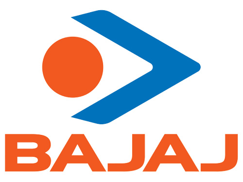
Brand: Bajaj Electricals Ltd.
Owned by: The Bajaj Group
Design: Elephant Design
Design brief:
An eye on the future
The new bajaj Electricals logo signifies dynamism. The old logo is replaced by an open eye, signifying the attitude to pursue new opportunities. The forward facing arrow signifies progress. The dot is a vermilion dot. This vermilion color is a reminder of India’s glorious culture. It carries the vigor of sun. Thus the logo reflects the company’s ideals, “Dynamic progress into the future while conserving indigenous culture.”
Logo release: January, 2004
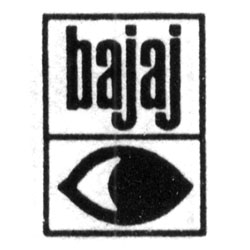
Previous Logo:
Is there someone behind me?
I feel that the Bajaj Electricals’ ‘eye on the future’ is actually looking backwards! The design brief specifies that the arrow is forward facing — in common man’s language, the arrow is a ‘greater than’ symbol. But that arrow makes the eye appear to be looking backwards. In the old logo, it is easier to identify that the eye is looking to the right side — which is generally perceived as ‘forward looking.’
“Eyes eyes baby!”
Here are a few logos that portray an eye.

This ‘Eye Bee M’ version of IBM logo is designed by the legendary corporate logo designer, Paul Rand.
Greater Than…
Here are a few logos that portray a ‘greater than’ symbol.



Some years back, Jockey prominently featured a ‘less than’ symbol in the tagline: The next best thing to “<“naked.
Bajaj Auto Ltd.
You can read Bajaj Auto Ltd.’s logo re-design effort here in this blog.
Acknowledgments
I would like to thank my friend Kishore Patnaik for providing me a ton of details to render this story.
