BRAND
Medium
OWNED BY
A Medium Corporation
LOGO DESIGNER
COLLINS
OFFICIAL DESIGN BRIEF
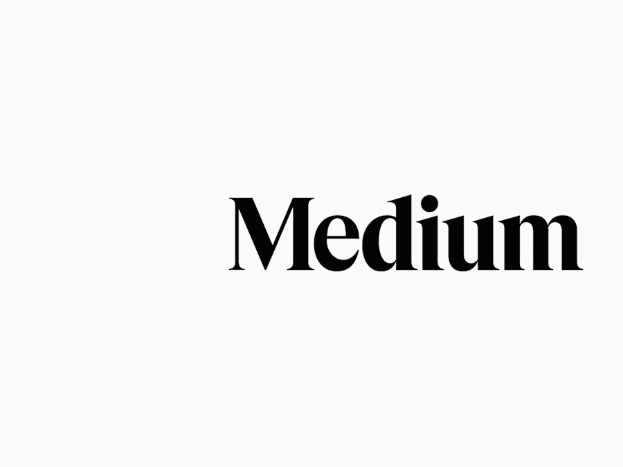
The fundamental concept behind our new design system is language as illustration. They say a picture’s worth a thousand words, and on Medium, a thousand words can paint a bigger picture. So in this new system, we use letters and words to construct images, and each image has a unique subtext tied to the concept it’s representing.
The symbol is inspired by language and typography. It is born from the ellipses: a punctuation mark that represents an unfinished or impending thought, an idea to come, what’s next. This is what happens on Medium — there’s always a new idea, always more to the story.
We built off the strengths of our existing wordmark and customized the letterforms to feel more inviting. The lines are smoother, the letters sit tighter for improved readability, and overall, it stands prouder. It’s fundamentally the same Medium wordmark, just with a makeover.
LOGO RELEASE
14 October 2020
PREVIOUS LOGOS
My Opinion
Ellipsis and Ellipses
The ellipsis …, . . ., or (in Unicode) …, also known informally as dot-dot-dot, is a series of (usually three) dots that indicates an intentional omission of a word, sentence, or whole section from a text without altering its original meaning. The word, (plural ellipses) originates from the Ancient Greek: ἔλλειψις, élleipsis meaning ‘leave out’.
– Wikipedia
In graphic design, when you change the proportion or position of visual elements, new meanings can be attributed. The ‘ellipsis’ punctuation mark — denoted by three dots — gets recognized when it is used after a sentence (or word). Also, the size of the dots should fall within a limit in relation to the font size. ‘Dots’ can be perfect circles or ellipses as long as they appear as a single unit.
Sadly, the Medium logo is placed ‘before’ the wordmark and it is ‘huge’ compared to the wordmark — it roughly occupies between the font ‘baseline’ and the ‘ascender line.’ So I couldn’t recognize the logo as ‘ellipsis’ till I read the design brief. Am I alone in this? What about you? Leave your thoughts in comments below.
My ‘Quick-fix’ on Medium Logo
The following are my world famous ‘five-minute-fixes’ for the Medium logo. Please bear with me — this is done in jest and it is not my intention to belittle the amazing work done by COLLINS 🙂
The size and position of the three ellipses convey that they form an ‘ellipsis’ at the end of the wordmark ‘Medium.’
If you are adamant in keeping the logo at its current position (before the wordmark), can we pack the three dots a little more tighter, scale them up and cut them in half? Let’s follow the tradition and say that the logo is an abstract form of the alphabet ‘m.’
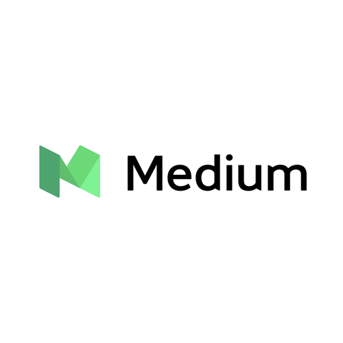
Basic Geometric Shapes Vs. Uniqueness
It is very difficult to come up with a unique logo when we are only using basic geometric shapes. Somewhere in the world, somebody might have already done that arrangement of graphic elements.
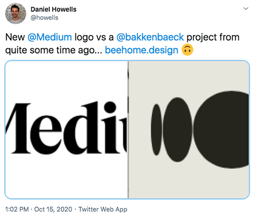
I scaled both the BEEHOME logo and Medium logo to the same size so that I can compare them.
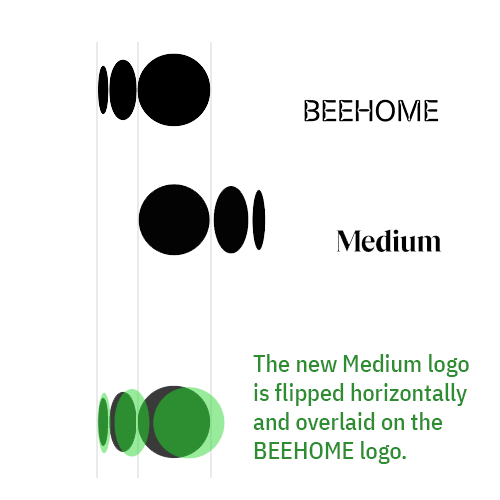
I don’t believe for a moment that this is some kind of plagiarism. This is pure coincidence. It appears that COLLINS and Bakken & Bæck came up with the same logo, independently, for two entirely different brands.
More Ellipses
A Google search on ‘Ellipsis’ logos returned a tonne of results. Here are some notable ones…


So, what’s the moral of the whole story?
A humble punctuation of an ‘ellipsis’ can take unique forms as brand identities eliciting varied meaning.
Peace.
Relevant Links
- A more expressive Medium — starting with Medium: An introduction to our evolved brand identity
- @Medium official Twitter thread on new brand identity
- COLLINS portfolio on Medium rebranding 2020
- About Medium: Every idea needs a Medium
- Brand New /UnderConsideration review on Medium Branding 2020
- Daniel @Howells’ tweet comparing Beehome.design logo with Medium logo 2020
- Bakken & Bæck portfolio on Bee Home branding
- MANUAL portfolio on Medium Branding 2017
- Brand New /UnderConsideration review on Medium Branding 2017
- Brand New /UnderConsideration review on Medium Branding 2015
- Beehive Green portfolio on Ellipsis Land Rebranding
Whoa, there’s some clever ellipses out there! As I absorbed your first, shorter commentary on the subject, I worked at enjoying the ellipsis in front of Medium…looking at their motion as if the many people who come to Medium…make it what it is. So it was ok to have ellipsis first.
Howevah, once i saw the longer version with all those well-selected examples… you have me re-considering.
Ha! ‘Ellipsis’ is indeed a good idea compared with their earlier ‘M’ monograms. Only thing is that I failed to see the new Medium logo as an ellipsis initially. Let’s see how the logo evolves over time.