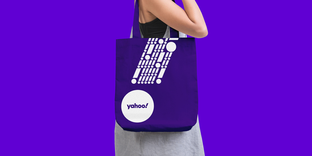
BRAND
Yahoo!
OWNED BY
Verizon Media
LOGO DESIGNER
Pentagram
Click here to download a high resolution logo.
DESIGN BRIEF
The identity reflects a new brand strategy for Yahoo that focuses on helping users find a more personalized, customized experience online. With its new products, Yahoo will empower users to better sift out irrelevant parts of the digital world, giving them more control of what they see and when they see it. The strategy positions Yahoo as an “amplification brand,” amplifying the things that matter, helping to “amplify you.” The idea is neatly visualized in Yahoo’s exclamation point, a punctuation mark that literally stands for amplification.
As with the original logo, the new identity captures the voice of a brand named after an exclamation of joy and discovery, and still looks like it should be shouted or yodeled (“yahoOOOOoooo!”). The repeating circles of the “a,” “o”s and the dot on the exclamation point echo of the audio mnemonic of the yodel.
LOGO RELEASE
23 September 2019
PREVIOUS LOGOS


y + ! = y dot. Why not?


Whenever I see a design, I always think what will I do differently, if I had the chance… So, here goes my version of the ‘y!’ monogram.
What do you think?

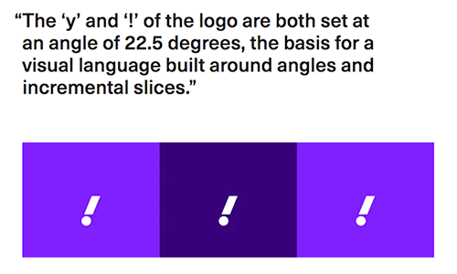
Angles and Slices
The new wordmark is set in Centra No. 2 Extrabold, and the letters of the logotype have been modified to be more geometric and compact. The exclamation mark has been italicized for emphasis, as it has been in every iteration of the logo since the company’s founding. The “y” and “!” of the logo are both set at an angle of 22.5 degrees, a forward tilt that suggests a sense of momentum and excitement. The angle––precisely 1/16th of a circle––is the basis for visual language built around angles and incremental slices.
The identity appears in purple, Yahoo’s signature color since 2003. (Internally, the rebranding was called “Project Purple.”) The designers refined the palette and made it more contemporary, selecting a primary purple (a bright shade they called “grape jelly”) and secondary purples (“hulk pants” and “malbec”), as well as accent colors.
Pentagram on Yahoo! Redesign project
One interesting thing popped up while looking at the ‘y!’ monogram was that Pentagram is talking about ‘angles’ and ‘slices’ as a new design trend. This time around, they are talking about 22.5 degrees of angle (from the vertical).
But this is nothing new! Every other logo you stumble upon daily is an italicized one.

Inspiring! Let me go offline now to create a logo with an inclination of 20 something degrees!
Exclamation Marks!