BRAND
J&K Bank
OWNED BY
Jammu & Kashmir Bank
LOGO DESIGNER
Ray+Keshavan | The Brand Union
OFFICIAL DESIGN BRIEF
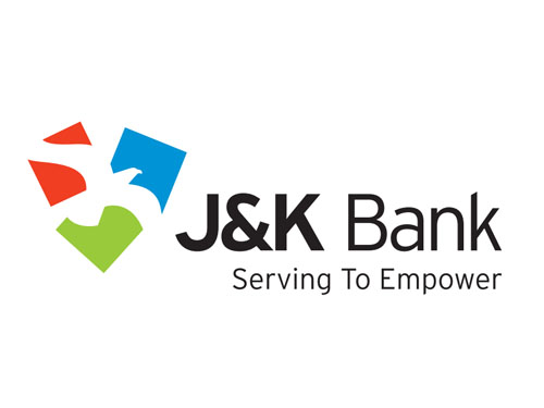
‘The three coloured squares represent the regions of Jammu, Kashmir and Ladakh. The counter-form created by the interaction of the squares is a falcon with outstretched wings – a symbol of power and empowerment. Green signifies growth and renewal, blue conveys stability and unity and red represents energy and power.’
LOGO RELEASE
2006
PREVIOUS LOGO

My Opinion
A bank logo has to be boring!
This was the general rule until recently in India; but it was shattered by a host of bank logo re-designs. Apart from J&K Bank, the other notable re-designs are Dhanlaxmi Bank (Read the story in kiKKidu), South Indian Bank (Read the story in kiKKidu), Canara Bank, Axis Bank (Formerly, UTI Bank), Bank of Baroda, The Catholic Syrian Bank and Punjab National Bank.
The State Bank of India logo (Read the story in kiKKidu) has completed 40 years of its existence and has acquired an iconic status.
I couldn’t find any other Indian bank logo that shows a bird. But there are logos which feature animals. Following are some such logos.
Birds in Logos
Eagle vacuum flasks were a leader in India in 1980s. But later they were challenged by other brands like ‘Cello.’ At one point of time, the following Eagle logo was printed on almost all articles like notebooks, school bags…

The only place where you can find bird images is on airline logos. The top 10 airline ‘bird’ logos that I like are:

SriLankan Airlines logo shows a stylized peacock. I must say that the colors are a little bit misleading as the logo resembles a red chilly!




Delightful logo for a bank. Just loved the colors!