
Brand: Pankajakasthuri
Owned by: Pankajakasthuri Herbals India (P) Ltd.
Design: Hammer Advertising, Kochi
Design brief:
“The logo — The wisdom radiating flower — symbolizes a forward-moving, multi-faceted, energetic and innovative company with the power to unlock an age-old healing tradition and deliver it for a new generation discerning health seekers.
At the metaphorical level, the logo is a representation of the human body as a flower in full bloom, free of disease. The seven filaments in this flower, approximate to the seven Dhatu’s – one of the foundational constructs of Ayurveda. Dhatus are the basic tissues, which maintain, nourish and support the body. When the seven Dhatus are in harmony, life is radiant and energized.
The color green was inevitable, for a company unraveling with the power of herbs. The fluorescent gradation, suggests drive, dynamism and enlightened ambition.”
Logo release: Unknown!
Previous Logo:

Other Lotuses
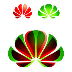
We have already talked about Huawei logo in this blog. Following is a comparison of Huawei and Pankajakasthuri logos — one overlaid over the other.

International Society for Krishna Consciousness (ISKCON)
Khiri Lotus
Relevant link:


What can i say, “hee hee hee!” Misuse of free vector download from internet, spoiled a lot of creative talents in Kerala.