
Brand: VLC Media Player
Owned by: VideoLAN Organization
Logo Designer: Richard Øiestad
Design brief: None available as of now. But we have the following story.
One day, people from the VIA Association (VIA is a students’ network association with many clubs… amongst those is VideoLAN) came back drunk with a cone. They then began a cone collection (which is now quite impressive i must say). Some time later, the VideoLAN project began and they decided to use the cone as their logo.
– Antoine Cellerier
(Core Team Member, VideoLAN, 2004-2009)
This cone is not more stupid than any other logo, it has a fun meaning and tag the project as really different of other craps
– Jean-Baptiste Kempf
(President, VideoLAN)
Logo release: Circa 2001
A Logo Like No Other
Note: VLC stood for ‘VideoLAN Client.’ Since the architecture of the software changed, we cannot apply the term now.
Usually, for any logo idea, we will see similar applications in this universe. For the first time, Google returned zero results for the search string “traffic cone logo.” It appears that VLC Media Player alone is using a traffic cone as a logo. Unbelievable, right?
A search in Logopond.com resulted in the following two logos, but they are not used by any organization as of today.
 Concept by Jerron Ames
 Concept by Jasper Dancer
The Three Cones
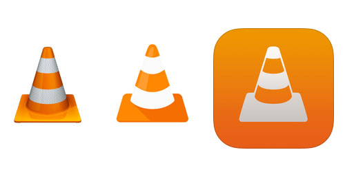
These are the three cones that are in use today. On the extreme left, we have the cone as it appears in VideoLAN website. It is a skeuomorphic design with prominent texture, shadows, reflections, highlights…
The cone on the middle is a minimalistic rendering of the first one. It appears as the app icon for VLC for Android App.
The cone on the right is the app icon for VLC for iOS. It is a negative rendering without a prominent shadow; but with a mild gradient.
Ideas on the Traffic Cone
To me, the logo conveys a meaning of “Under Construction.” It can be argued that the VLC Media Player is always being improved and thus the logo can be justified.
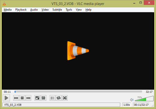
My suggestion: Can we use the animated versions of the traffic cone instead of the standard play, pause, stop buttons in the media player?
Relevant links:


Nice research Anas. These days, people have started to call the actual “cone” as a VLC player! The player reached that level of influence with the users.
Ha! That’s true!
Good article, Anaska… 🙂
Thanks!
Nice article. I just searched google and it’s correct !! Also it’s so cool VLC doesn’t need to spend so much on brand awareness campaigns, they have the live logo displayed all over the world 🙂
Exactly. Marketing genius!
Good one, Anas! @Nizaj, good point, that!:-)
Awesome, nice article…
🙂